
My Rough Drafts
artman4444
Published
01/18/2012
Sometimes it requires several different drawings to get a picture down correctly. In this case, I was using a wooden figure to draw the characters for proportion, but the end result seemed too artificial, and not organic.
- List View
- Player View
- Grid View
Advertisement

-
1.
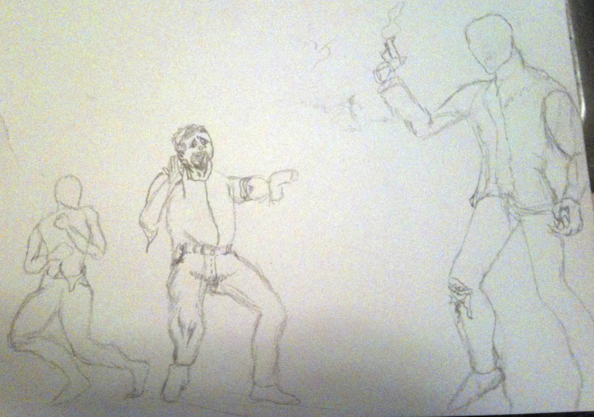 This one didn't work because Jessie, the crook, was too large, when I wanted Greg to be the biggest character
 -
2.
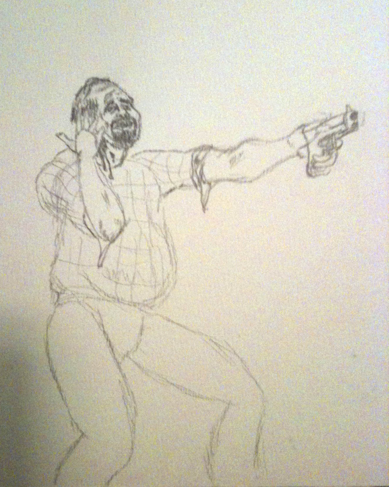 This was a little bit better in definition of what Greg looks like, but I couldn't get enough detail in the face
 -
3.
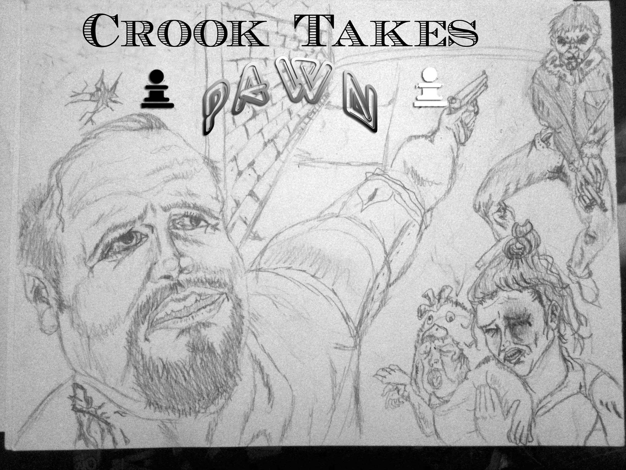 This is the final title. I like the PAWN letters because it looks like a neon pawn sign Also the other font is used on dollar bills

- REPLAY GALLERY
-
Replay
- My Rough Drafts
- NEXT GALLERY
-

- 24 First/Latest Roles of the Hollywood Superstars
This one didn't work because Jessie, the crook, was too large, when I wanted Greg to be the biggest character
3/3
1/3

0 Comments