Design is supposed to make life less confusing, prettier, or at least easier to navigate, but sometimes it does the exact opposite.
From logos that accidentally advertise the very thing they shouldn’t, to furniture that feels more like a practical joke than a useful object, the world is full of “what were they thinking?” moments you can’t unsee once you spot them.
These fails are painful, unnecessary, and unforgettable. Most of all, they’re completely preventable, if only someone had taken a second, longer look. Together, they serve as a reminder that not every idea deserves to leave the drawing board.
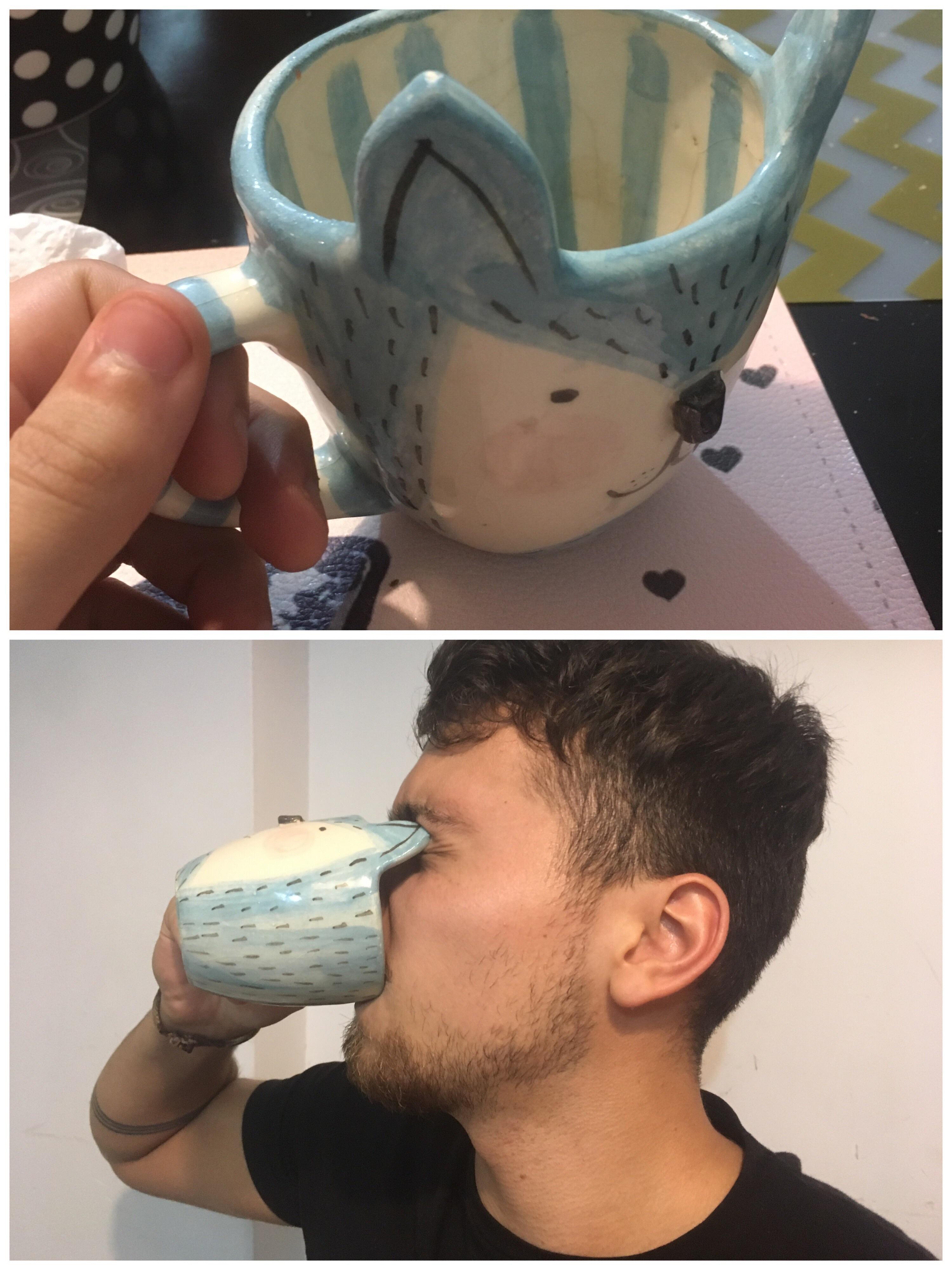
1
Nothing like a hot drink AND a blindness.
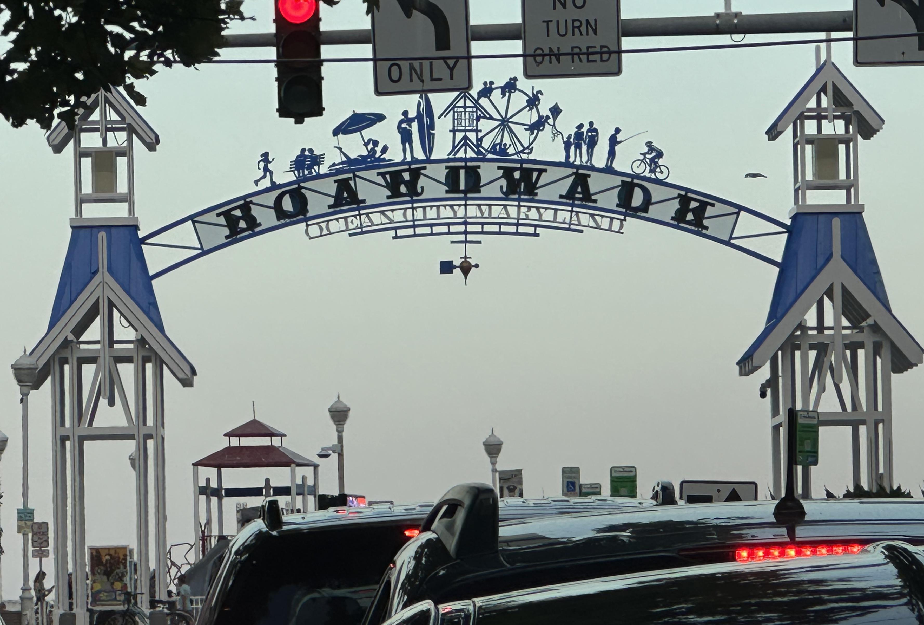
2
Where spelling is also on vacation.
3
We the grammar are struggling.
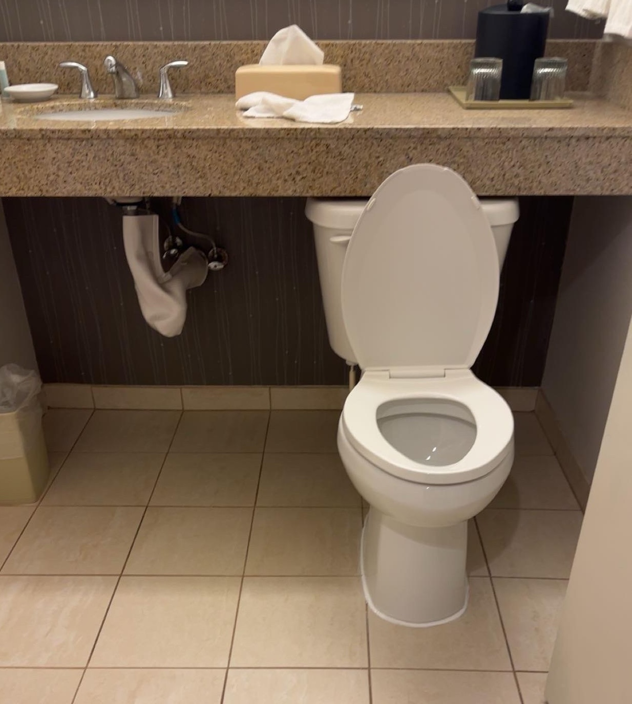
4
When you want some bonding time.
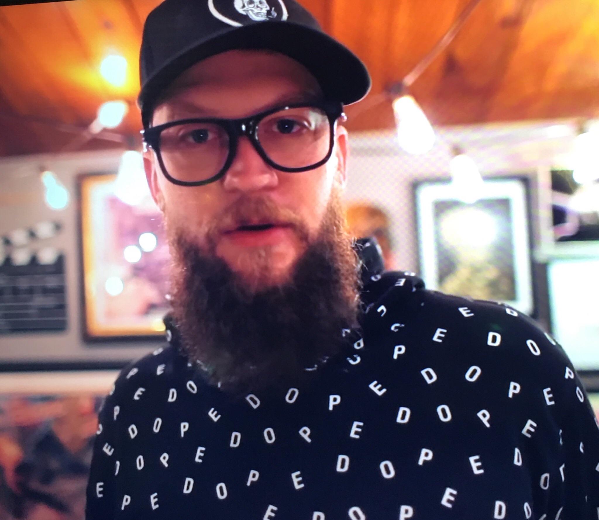
5
When your shirt spells DOPE but also something else if you stand wrong.
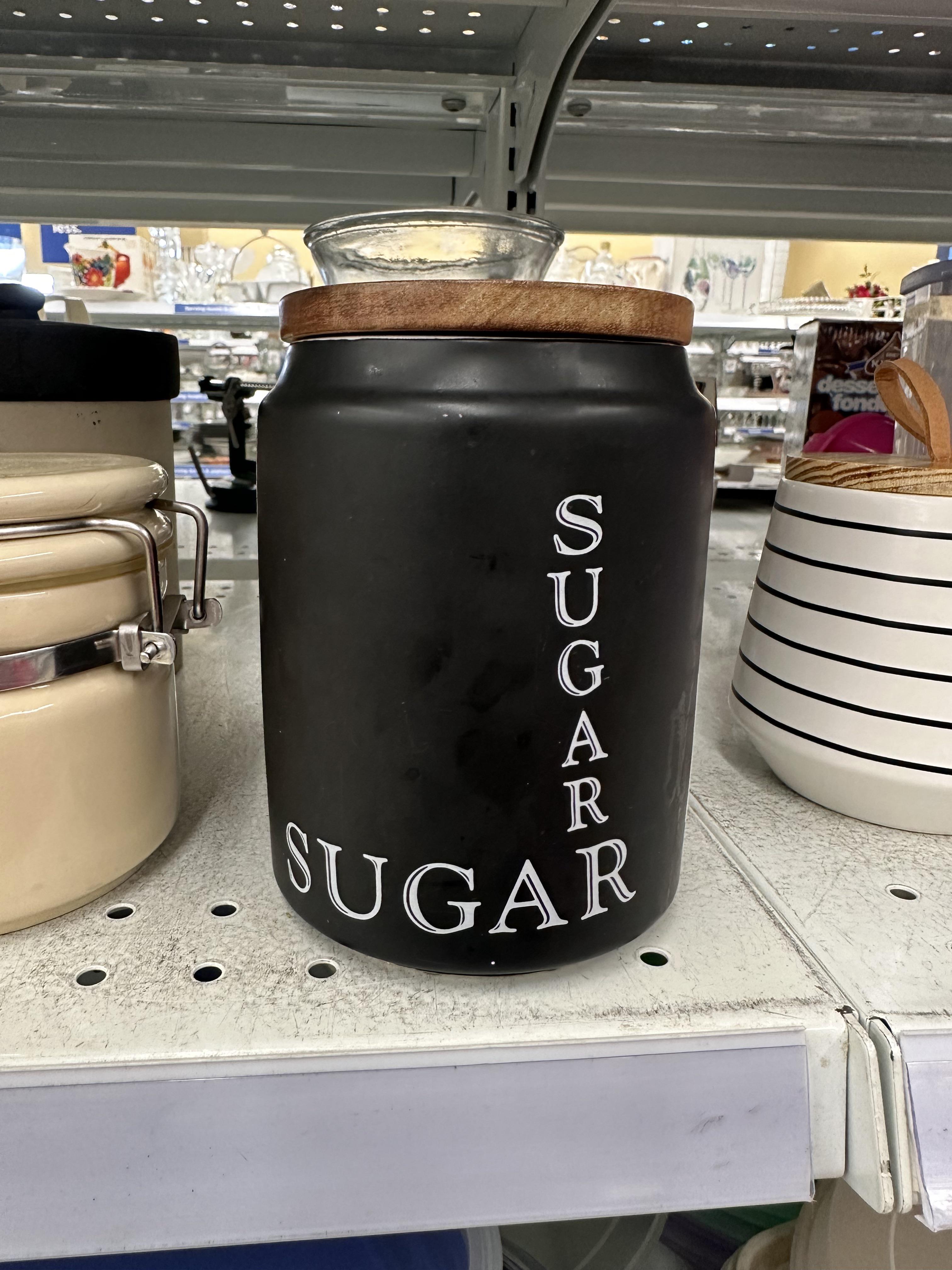
6
Just in case you forgot what sugar was halfway around the jar.
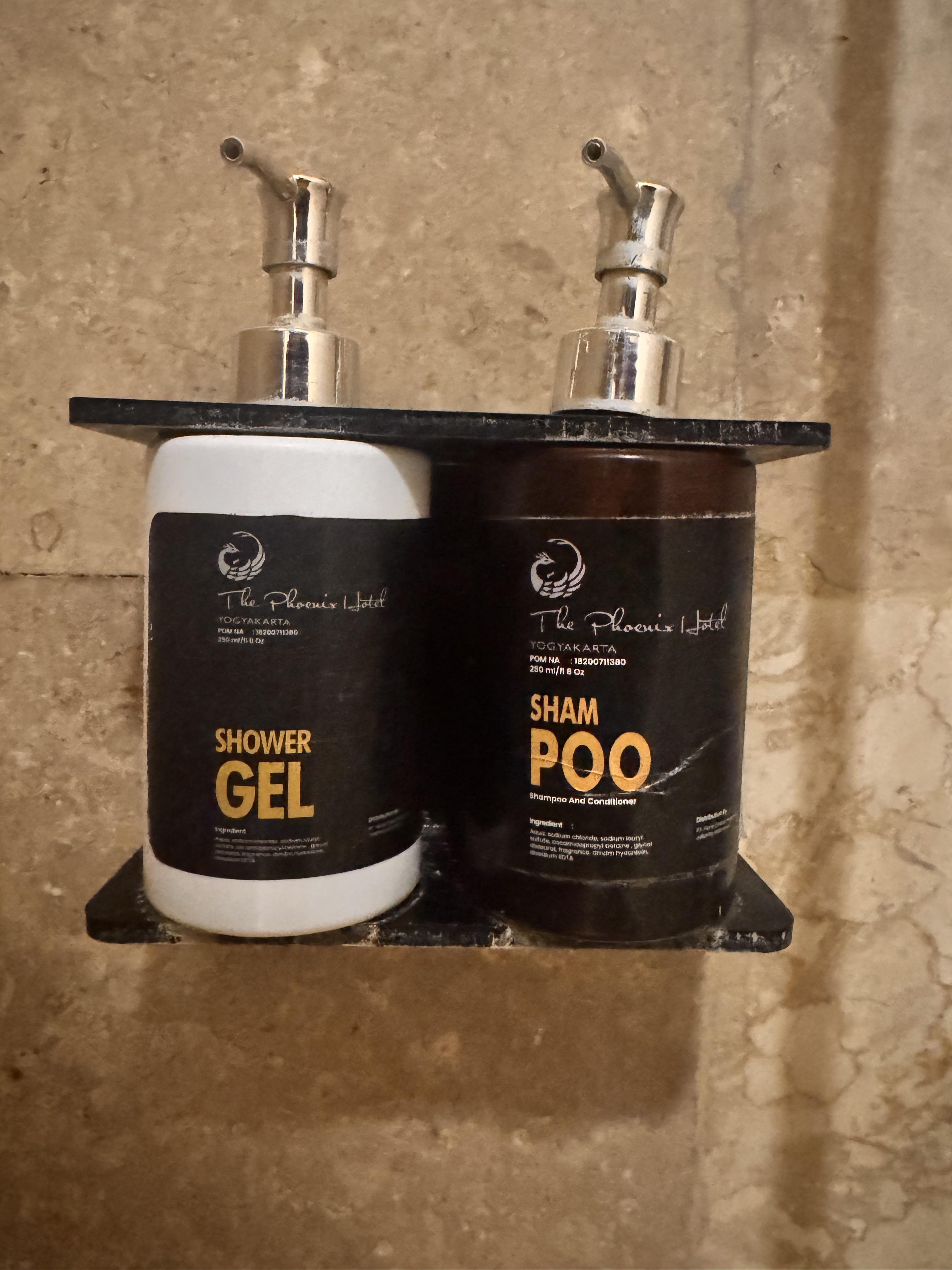
7
This aggressive turn in a fast lane? Who even came up with this?
8
So everything just slides right off.
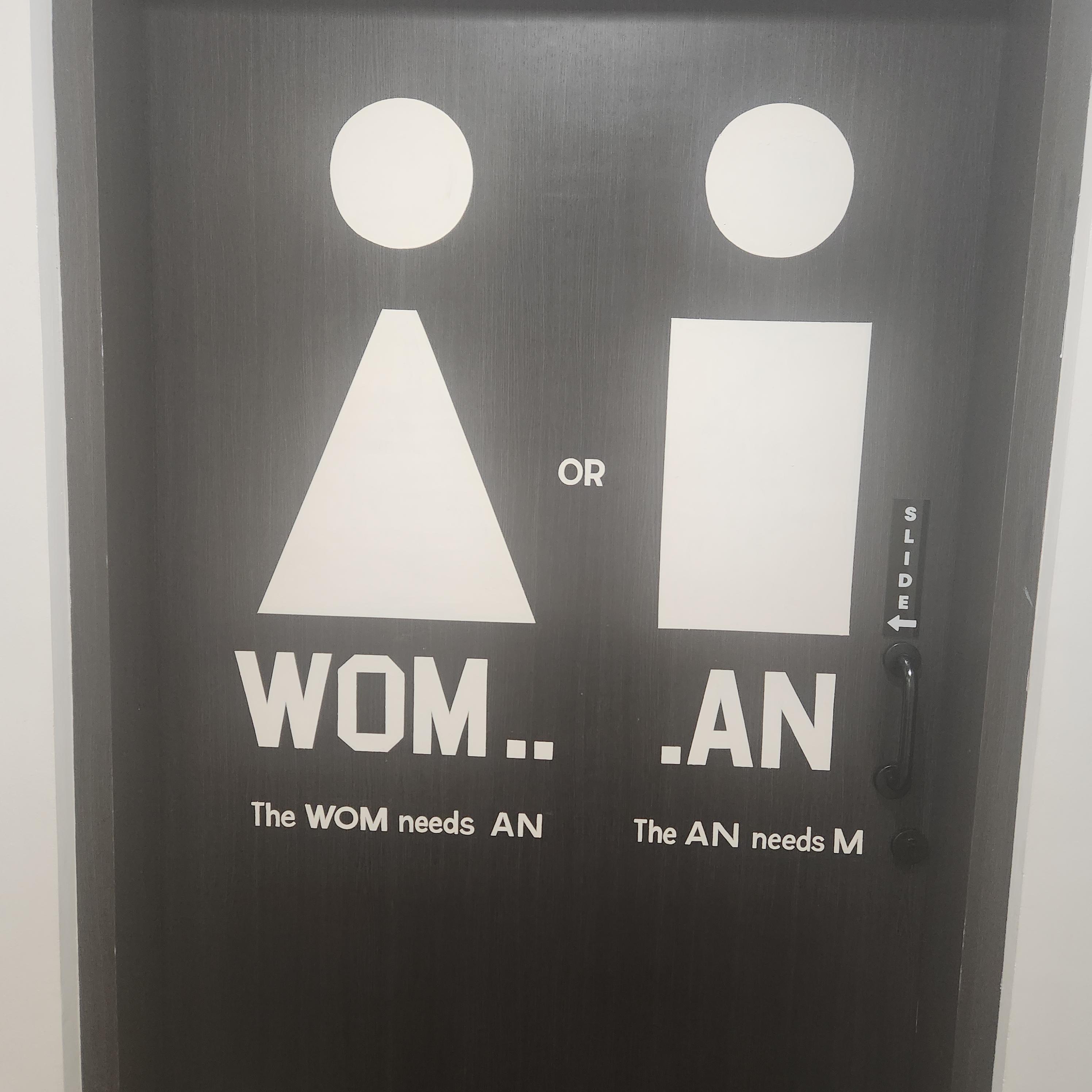
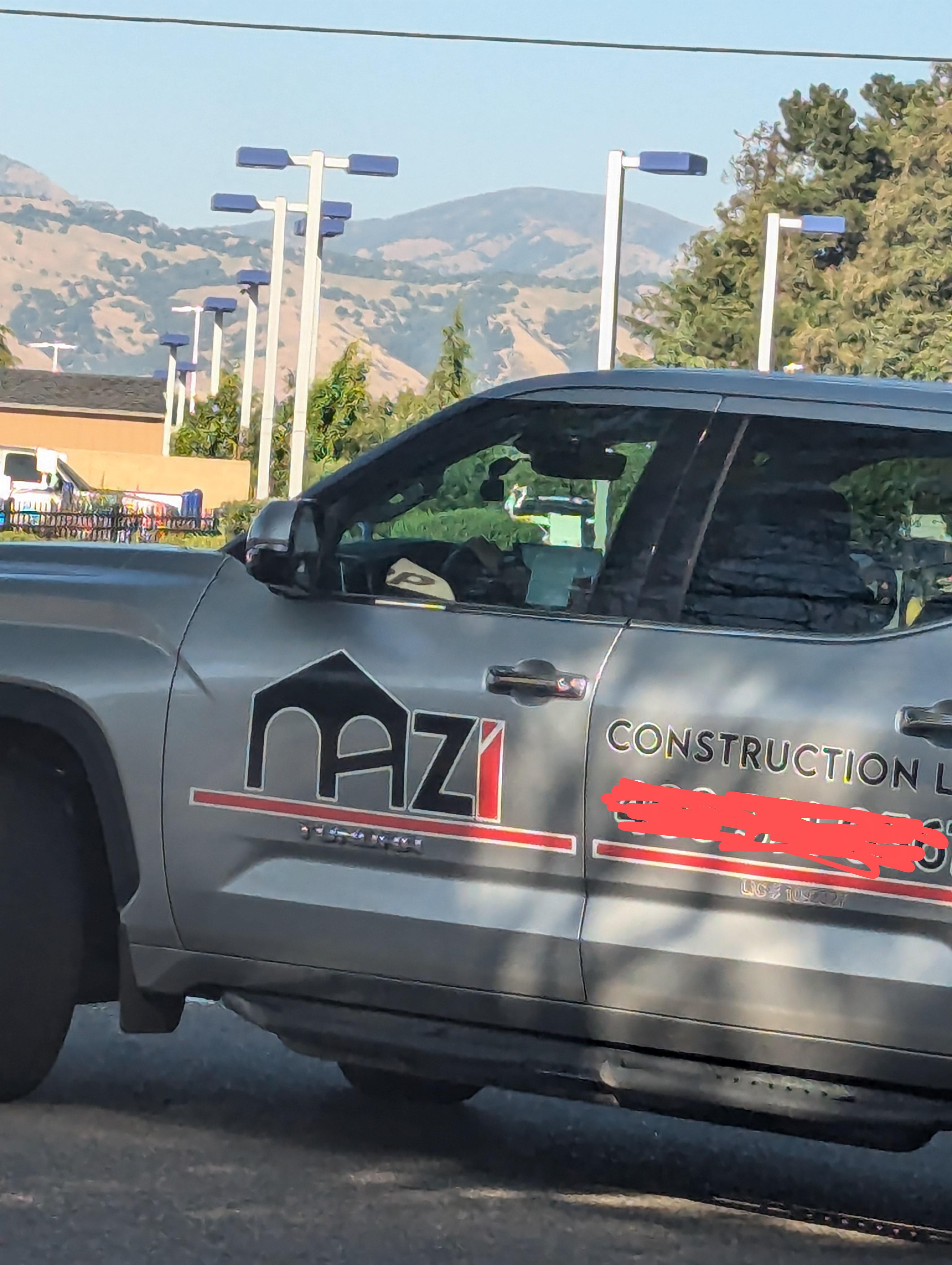
9
Equality achieved: Everyone’s confused.
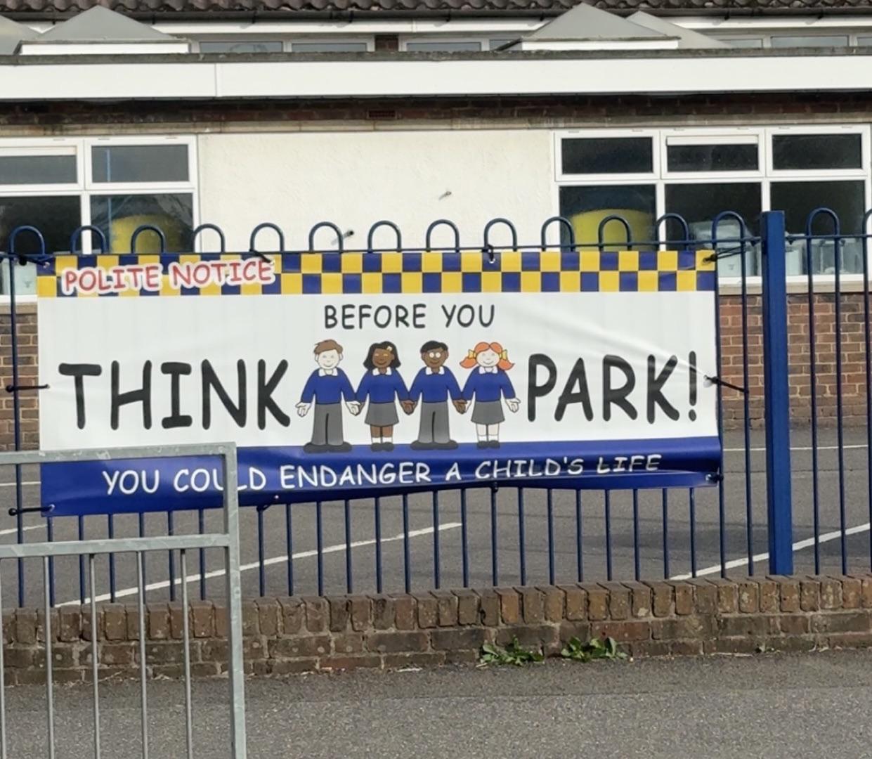
10
All I see is ‘THINK CHILDREN PARK’ which sounds like a horror movie.
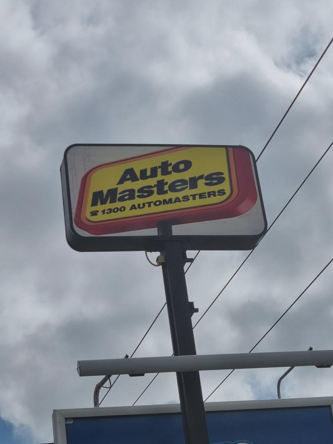
11
Nothing says professional like a logo that looks like it’s sliding off the sign.
12
What's a bulldoc exactly?
13
When you order Roman architecture from a shady website.
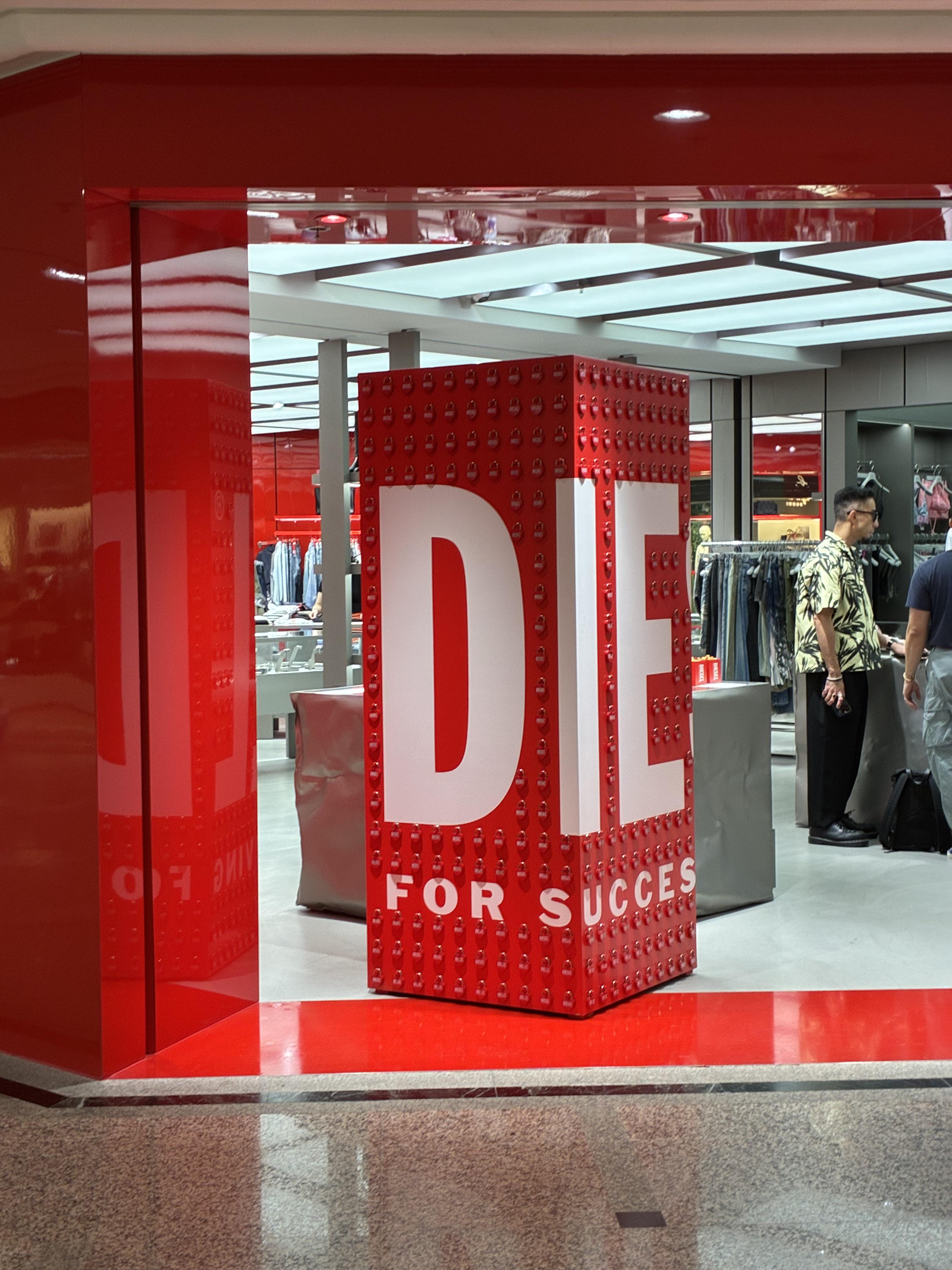
14
When the motivational poster is a little too direct.
15
Nothing like scrubbing your hair with this.
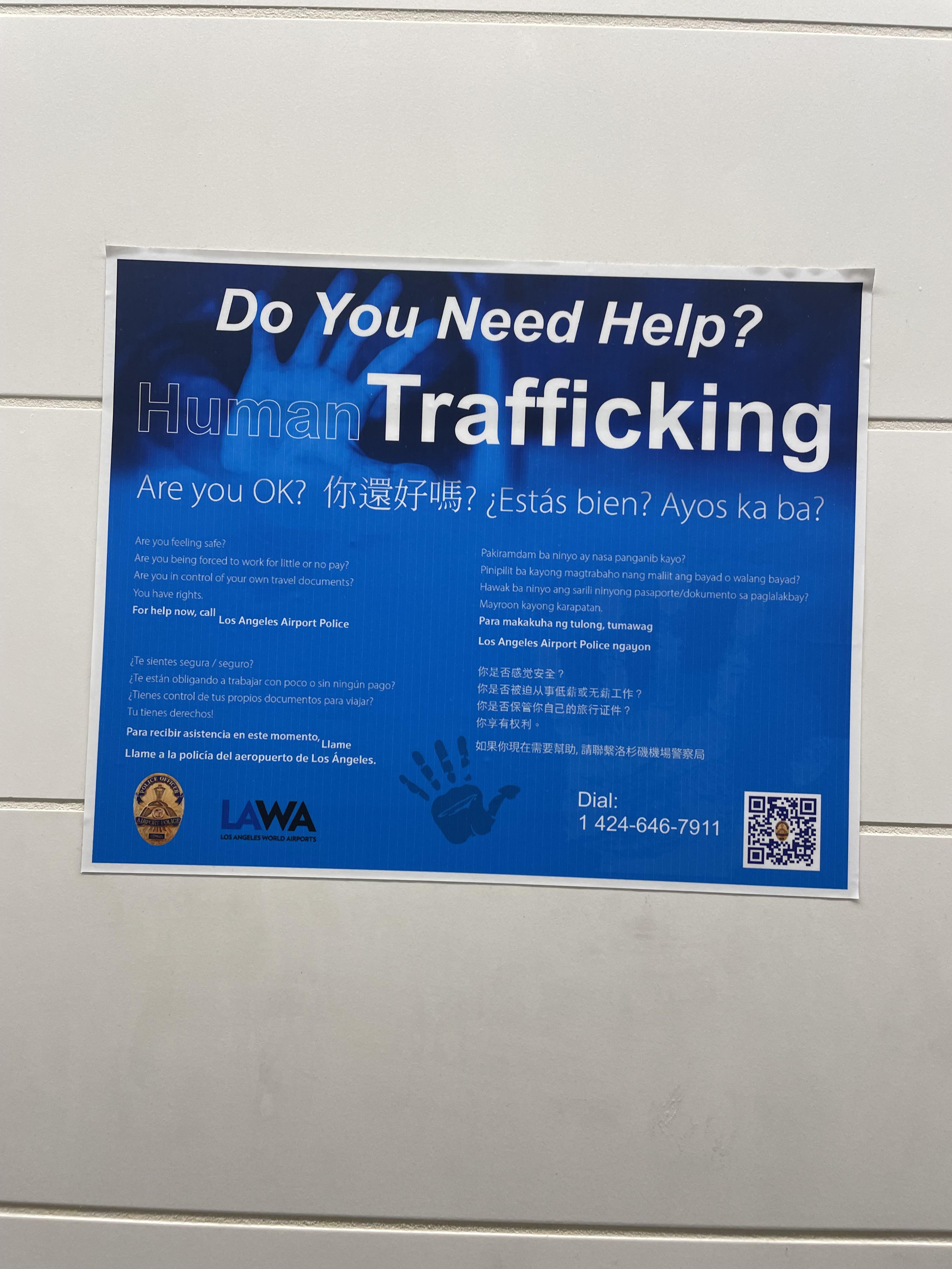
16
Do you need help? Trafficking. No thanks.
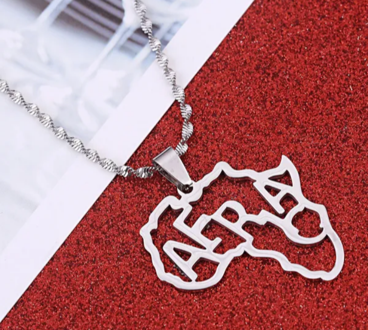
17
Nothing screams geography fail like spelling it AFRA.
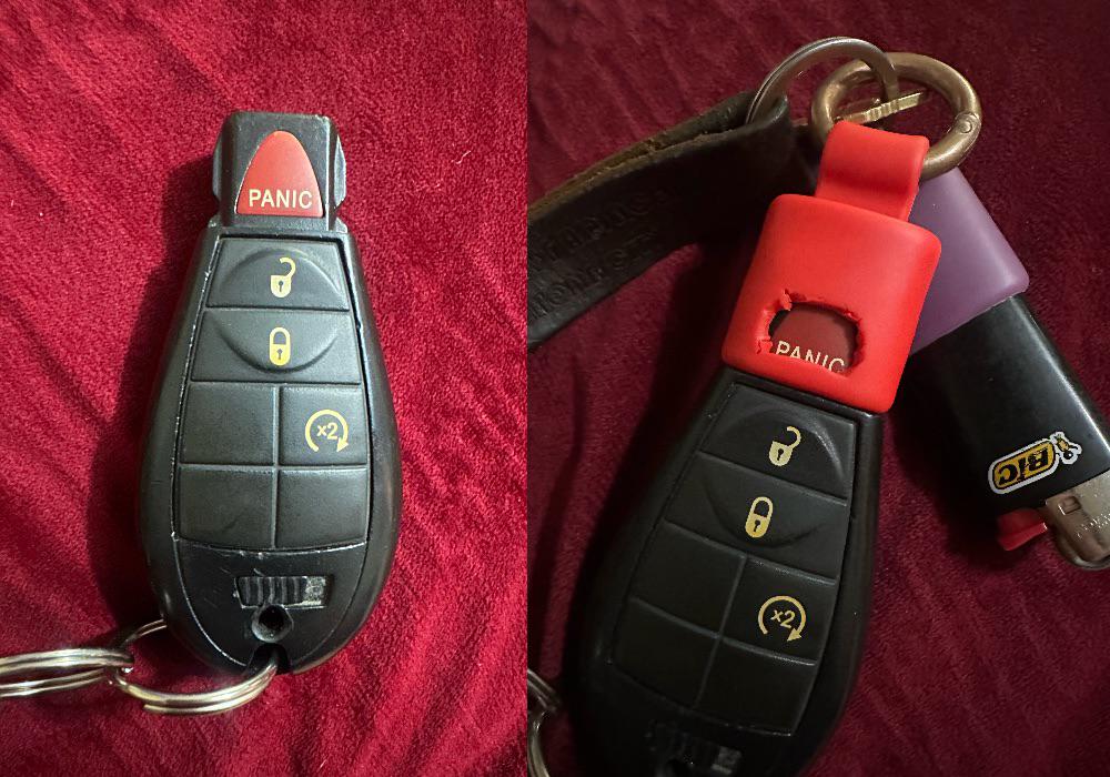
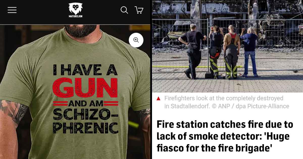
18
Congratulations, you’ve upgraded from Panic button to Constant anxiety mode.
19
When your font choice turns your business into a hate group.
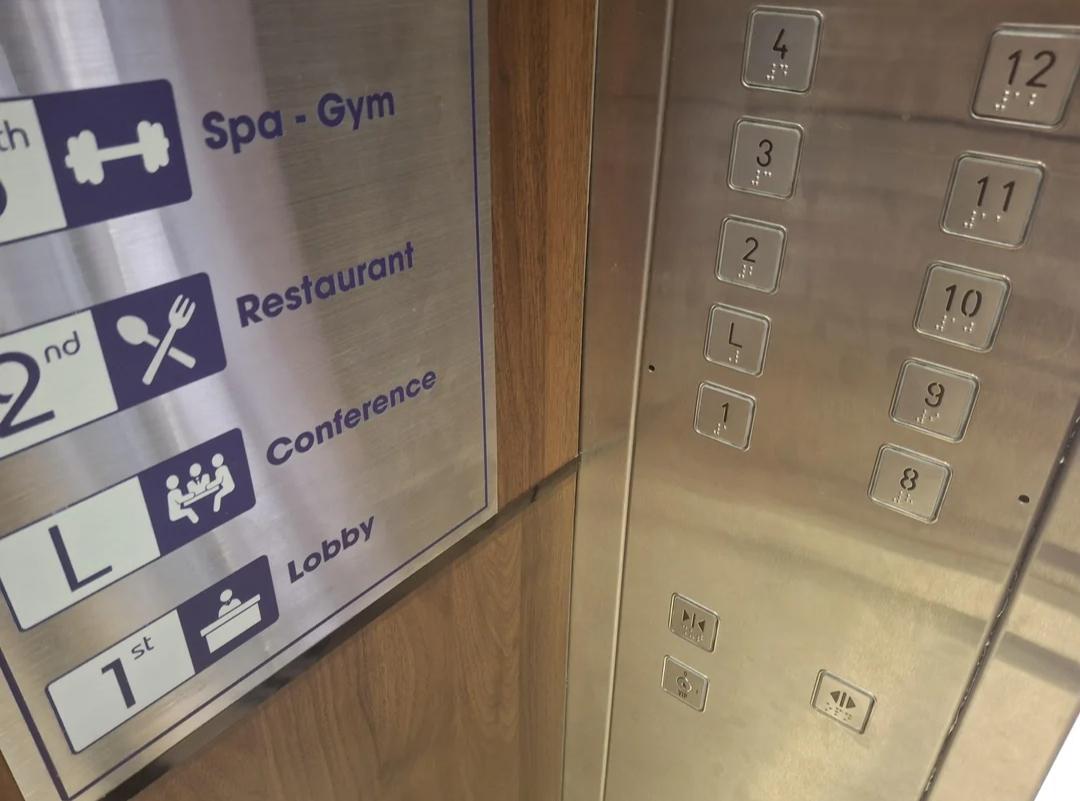
20
Floor L for Conference and 1 for Lobby? Great, not confusing at all.