
25 Interesting Infographics Full of Intriguing Information
MainFeature
Published
09/02/2020
in
wow
A good picture is worth a thousand words, maybe even more.
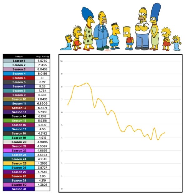
For instance, we all know in our hearts that 'The Simpsons' hasn't been that good in a long time and that the earlier seasons were some of the best - but seeing the average ratings for each season actually graphed out shows a much clearer picture of the show's decline.
The information presented in these graphs ranges from totally random to totally useful. Either way, you'll walk away having learned something.
- List View
- Player View
- Grid View
Advertisement

-
1.
-
2.
-
3.
-
4.
-
5.
-
6.

-
7.
-
8.
-
9.
-
10.

-
11.

-
12.
-
13.

-
14.
-
15.
-
16.
-
17.

-
18.

-
19.
-
20.
-
21.

-
22.
-
23.

-
24.
-
25.

- REPLAY GALLERY
-

- 25 Interesting Infographics Full of Intriguing Information
- NEXT GALLERY
-

- 25 Shower Thoughts That Your Brain Will Soak Up
25/25
1/25
Categories:
Wow


10 Comments