eBaumsWorld: Funny Videos, Pictures, Soundboards and Jokes
Funny Galleries Funny Videos Games Time Wasters Internet Classics
eBaumsWorld: Funny Videos, Pictures, Soundboards and Jokes
  • Funny Galleries
  • Funny Videos
  • Games
  • Time Wasters
  • Internet Classics
Funny GalleriesFunny VideosGamesTime WastersInternet Classics
  • 1 - 10
  • 11 - 17

Maps That Show The True Sizes Of Things

Wow... whoever creates classroom maps, really sucks!

By aesir911

Published 9 years ago in Wow
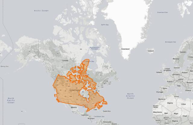
Wow... whoever creates classroom maps, really sucks!
  • 1

    And if you do the same thing with the UK, it’s easy to understand why we’re not exactly used to warm weather. To the west, the UK shares a latitude with deepest Canada, and on the right you can see that Edinburgh is on a level with Moscow.

    Maps That Show The True Sizes Of Things

  • 2

    And finally, here’s what happens when you place the 10 largest countries in the world next to each other on the equator.

    Maps That Show The True Sizes Of Things

  • 3

    Staying with the States, a Reddit user had the great idea of seeing what would happen to a rectangular state, such as Colorado, as you move it north from the equator.

    Maps That Show The True Sizes Of Things

  • 4

    And here’s what happens when you overlay the five largest countries in Africa on top of the In case you’re wondering, from largest to smallest they are: 1. Algeria (red), 2. DRC (pink), 3. Sudan (blue), 4. Libya (purple), and 5. Chad (orange). USA.

    Maps That Show The True Sizes Of Things

  • 5

    Being so close to the equator, Africa gets mightily screwed by the Mercator projection. Here’s what happens to the Democratic Republic of the Congo as you move it north.

    Maps That Show The True Sizes Of Things

  • 6

    Things really get crazy when you move the US (minus Alaska and Hawaii) down under.

    Maps That Show The True Sizes Of Things

  • 7

    Overlaying California on top of the UK, you get a sense of just how tiny we really are. Or, perhaps, how much we (try to) punch above our weight?

    Maps That Show The True Sizes Of Things

  • 8

    Greenland is arguably the place that is most blatantly taking the piss. On the equator it would be a similar size to many central African countries, and though it’s still big compared with the US, it’s not quite as terrifying as it once was.

    Maps That Show The True Sizes Of Things

  • 9

    But because it’s so far north, the UK also benefits from the shortcomings of the Mercator projection. If Britain were on the equator it would be absolutely tiny. But at least the weather would be tolerable…

    Maps That Show The True Sizes Of Things

  • 10

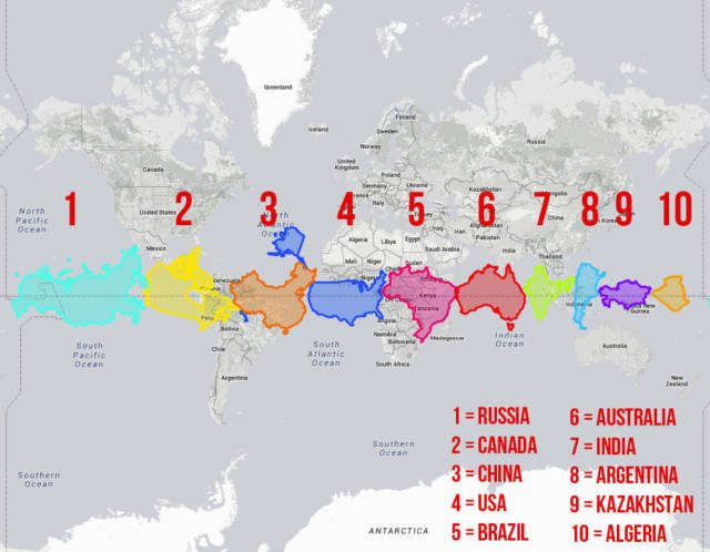
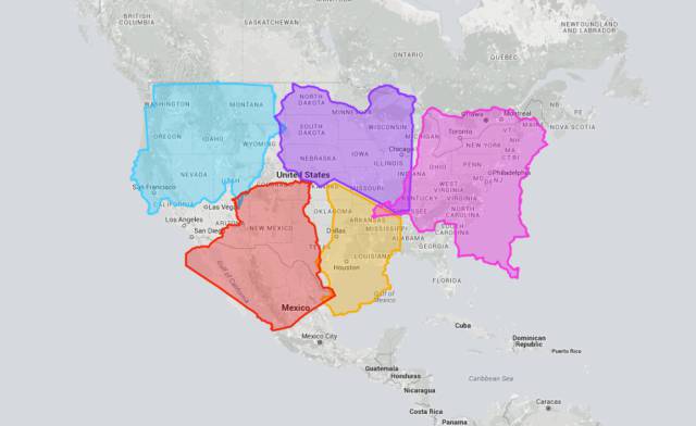
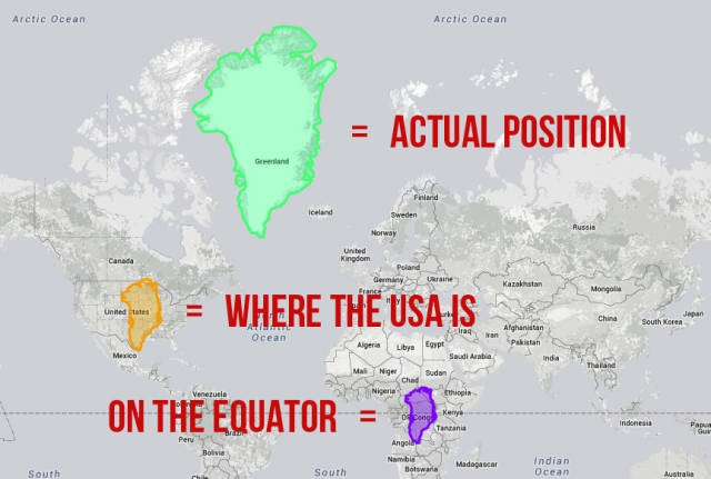
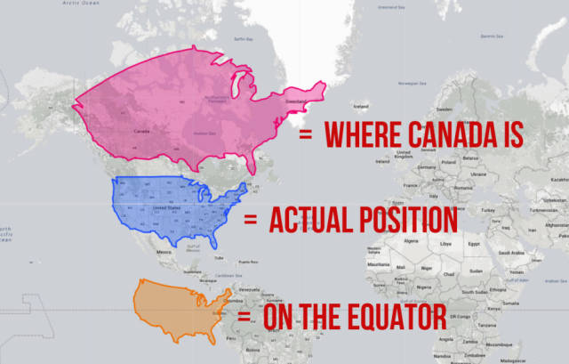
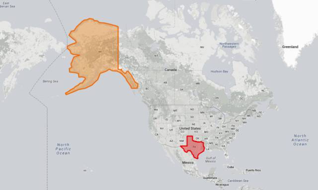
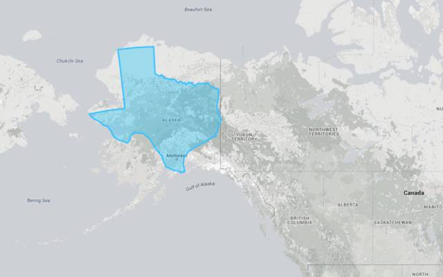
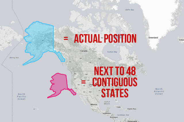
    Firstly, you can see how the size of the US drastically changes as you move it north or south. Some countries are significantly larger than they should be thanks to the Mercator projection, while others – anything near the equator – are definitely getting a bum deal. The US falls somewhere in the middle. On a standard map it’s dwarfed by Canada, but here you can see that moving it to where Canada is located makes it seem even more prominent than it already is. Note: This post will frequently use the USA as shorthand for the 48 contiguous states. We love Hawaii and Alaska, honest – it’s just easier to fit things in this way. Alaska is HUGE. Or is it…

    Maps That Show The True Sizes Of Things

  • 11

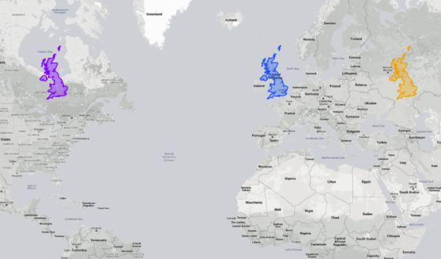
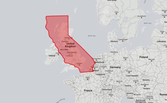
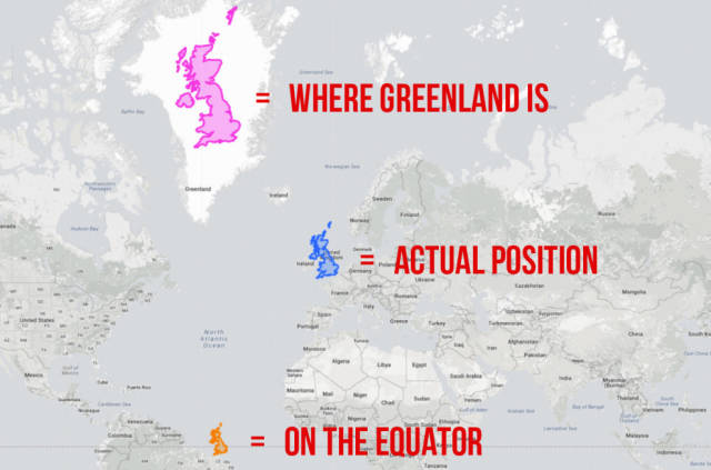
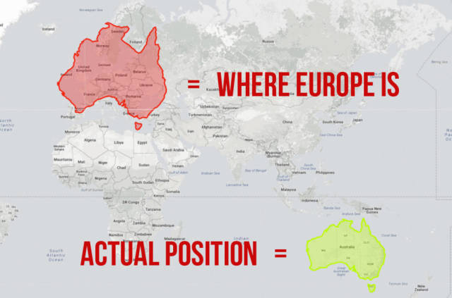
    This map shows how big the USA is compared with Europe, but it also does something else rather interesting… This map actually shows the exact latitude of the USA, so it really helps you understand the relative positions of cities on opposite sides of the Atlantic. For instance, Paris actually sits just north of the Canadian border, Chicago is found at nearly the exact same latitude as Istanbul, and Florida extends as far south as southern Egypt!

    Maps That Show The True Sizes Of Things

  • 12

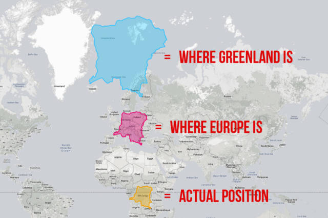
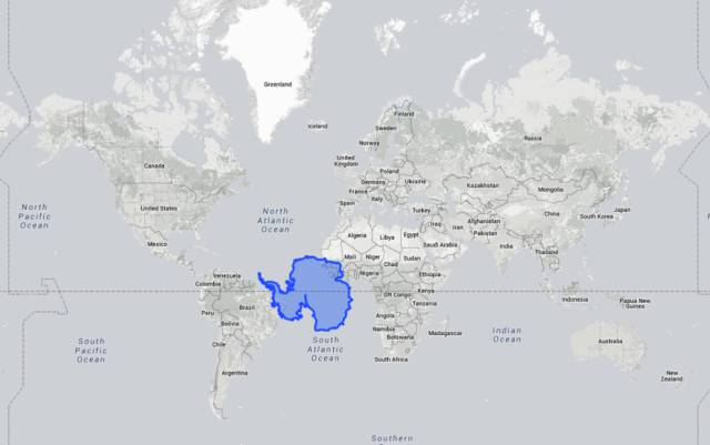
    Now onto a continent that usually takes up the whole of the bottom of a map – Antarctica. The Mercator projection really goes to shit when it comes to land masses that cover the poles. It’s usually impossible to tell how big Antarctica really is just from looking at a map, but using this tool we can see it’s roughly the size of western Africa. So now you know.

    Maps That Show The True Sizes Of Things

  • 13

    Or, at least, not THIS much difference.

    Maps That Show The True Sizes Of Things

  • 14

    And if you move the USA’s second largest state, Texas, over the top of it, you can see there isn’t too much difference.

    Maps That Show The True Sizes Of Things

  • 15

    Back to Alaska – this map shows that, while it’s still the biggest US state, it’s nowhere near as big as most maps make it look.

    Maps That Show The True Sizes Of Things

  • 16

    People often forget how big Australia is because it’s so far away from other land masses. Here’s what happens when you move it over Europe. Yep, it pretty much covers the whole of the continent. Struth!

    Maps That Show The True Sizes Of Things

  • 17

    And if Canada is moved down to where the US is, it’s clear that they aren’t as dissimilar in size as most people think.

    Maps That Show The True Sizes Of Things

Categories:

Wow

Tags:

aesir911 fake dumb idiots school fail
Scroll Down For More


Most Popular

17 Movie Mistakes That Somehow Made the Final Cut

17 Movie Mistakes That Somehow Made the Final Cut

Unique Photos From Around the World and Across Time

Unique Photos From Around the World and Across Time

21 People Whose Workday Just Went From Bad to Worse

21 People Whose Workday Just Went From Bad to Worse

  • About Us
  • Privacy
  • Terms
  • DMCA
  • Contact

If you are the original creator of material featured on this website and want it removed, please contact the webmaster

Copyright© 1998-2025 Literally Media