The Most Hideous Pro Sports Jerseys of All Time
Let's take a look at some of the ugliest jerseys in history.
Published 1 year ago in Facepalm
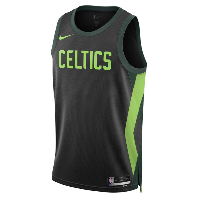
Typically, after winning a championship, you get to spend the offseason doing a metaphorical victory lap where you taunt all other teams for not winning a championship. But that hasn’t exactly been the case for the Boston Celtics.
Despite winning the NBA title, the Celtics have had a strange offseason. Jason Tatum rode the bench while LeBron and Steph won the gold medal for Team USA and a leaked alternate uniform has fans and analysts pretty confused. Why? Because it’s really ugly.
So, as a tribute, here are 15 of the ugliest pro sports jerseys of all time…
1
Celtics
Love them or hate them, the Celtics are one of the truly iconic franchises in all of sports, and their jerseys are an extension of that. I get that alternate jerseys are part of sports now, but seriously, Boston, you couldn’t do better than this? That Celtic green is immediately recognizable so why not use it? These jerseys are equal parts uninspired and ugly.
3
Ravens Mustard Pants
This is a little bit of a cheat because the Ravens jerseys are, across the board, pretty great. The all-black look is a personal favorite. But the mustard yellow pants are an abomination that should never be allowed on the field. Baltimore, please do yourselves a favor and don’t ever bring these back.
4
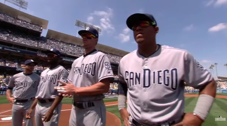
Padres 2010s Jerseys
As a Padres fan, I’m a little biased, but for the most part, the team has had some of the coolest uniforms in the game. Except for their incredibly boring rebrand where they had the most bland uniforms in the MLB for over a decade. Just unimaginative dreck all around. Thank the good Lord above that is over, and they’ve returned to a much better modern look.
5
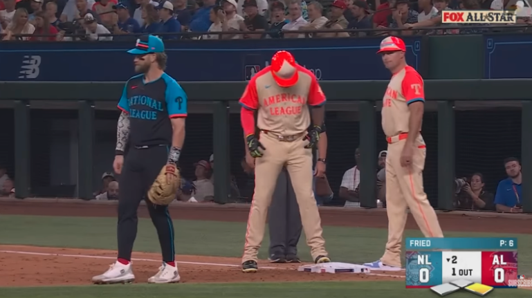
MLB All-Star Game Jerseys
This is a classic case of “if it ain’t broke, don’t fix it.” The MLB decided to create jerseys for the All-Star Game, and, respectfully, they were bad. This is something the league will do from time-to-time for no reason. Just go back to letting everybody wear their own uniform!
7
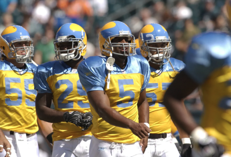
Packers Throwback Jerseys
If these throwbacks have taught us one thing, it’s that NFL jerseys used to look incredibly dumb. I get the idea of doing a throwback to the early days of the league but the Packers don’t need any changes to their uniforms. And they definitely don’t need these goofy-looking alternates.
8
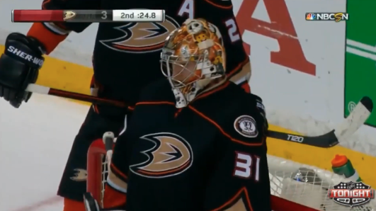
Anaheim Ducks (2015)
For some reason, the Ducks seemed to get embarrassed about the fact that they owe their existence to a totally awesome Disney movie from the ‘90s. They dropped the “Mighty” and abandoned the classic style in favor of something more “understated.” Huge mistake. Whoever convinced the team to embrace their history deserves a raise because the logo remains one of the coolest in all of sports.
10
Eagles 1934 Throwback
Another god-awful throwback. Apparently, 90 years ago, the Eagles had the ugliest uniforms in football. Why do we need to pay tribute to that? Luckily, these don’t seem to be returning any time soon.Side note: The Eagles should just permanently switch to the Kelly Greens, right? The primary jerseys are good but these are some of the best jerseys in all of sports. Plus, they work as a throwback that actually works.
11
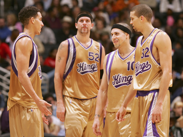
Kings’ Fools Gold
Purple can be a divisive uniform color but I’m firmly in the pro-purple camp, especially for Sacramento. But I’m completely against the gold jerseys that the Kings would rock during the Bibby era. They have routinely been called the ugliest jerseys in NBA history, and it’s hard to disagree, as these eyesores can’t even be enjoyed ironically.
12
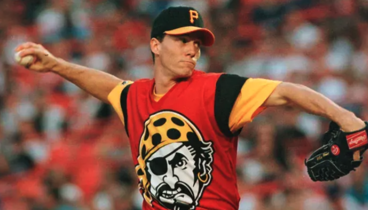
Pittsburgh Pirates (1999)
When it comes to uniforms, I love some city-wide synergy, and Pittsburgh’s commitment to black and yellow is undeniably rad. But like the Steelers, the Pirates once stepped away from their iconic color scheme to create something truly hideous. Thankfully, these red monstrosities appear to have been left in the past.
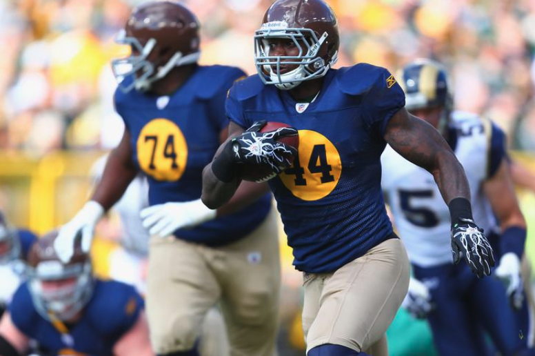
13
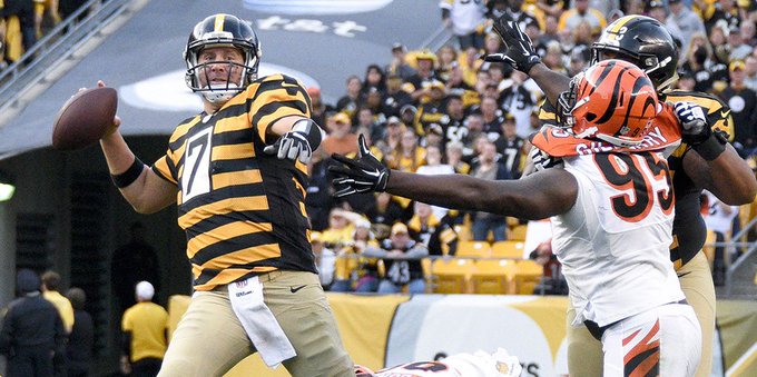
Pittsburgh Steelers Bumble Bee
The Steelers don’t like change. They’ve had three head coaches in the last 55 years and have been rocking the same jerseys for even longer. Fortunately, their standard jerseys are so historic and beloved that they don’t need to be changed at all. On the flip side, their bumblebee alternates were an embarrassment that were mercifully “retired” in 2016.
14
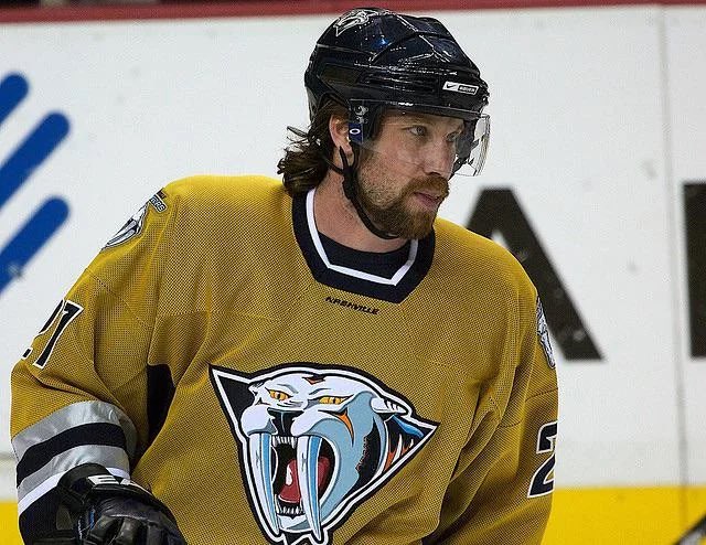
Nashville Predators
Hockey jerseys are, generally speaking, the least likely to look terrible out of the major North American sports. I’m not really sure why, but most of them look, at the very least, solid. Nashville’s early aughts alternate is one of the sport’s biggest missteps, as the color is an affront on the eyes. How did they have this for seven years???
Most Popular