
Canada Almost Had A Very Weird Flag - 21 pics
mexico1973
Published
02/16/2015
This week Canada celebrated the 50th anniversary of their national flag. The Maple Leaf flag that we all recognize today was actually a contentious choice 50 years ago. Many designs were put forward before one was ultimately chosen. Check out the ones that didn't make the cut.
- List View
- Player View
- Grid View
Advertisement

-
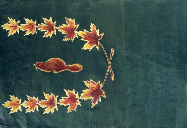
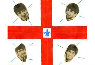
1.
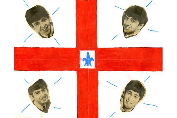 There will be beavers (and Beatles for some reason).
 -
2.
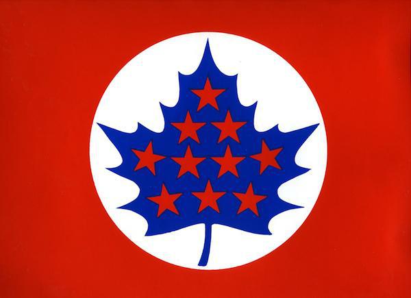 This design used ten stars to represent the ten provinces of Canada. Presumedly, had more provinces been declared, they would have found a way to add them.
 -
3.
 The United Nations blue was considered as a way to remind Canadians of their international obligations as a growing world power.
 -
4.
 A lot of people did not want the flag changed at all and some entries were purposefully poor as a way to waste the selection committee’s time. This entry included a strongly worded letter from a citizen from Quebec.
 -
5.
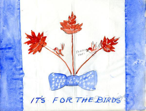 Another protest flag, this one includes the phrase “for the birds.” It was a popular rallying cry for those opposed to the Prime Minister’s proposed design.
 -
6.
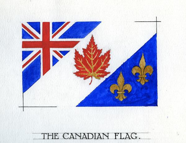 Some thought that Quebec would not approve of any flag that did not contain a fleur-de-lis.
 -
7.
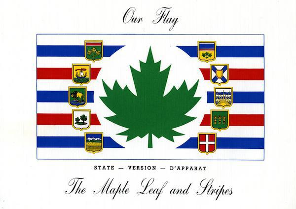 This design was meant to be used in conjunction with another flag. One with the shields (for state events) and the other without for everyday use. The green leaf was one of the few flag designs to use the leaf in an undead state.
 -
8.
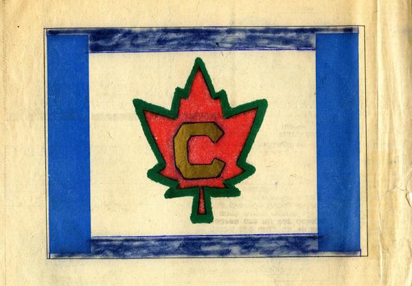 This flag design was an homage to the history of Canadian hockey uniforms.
 -
9.
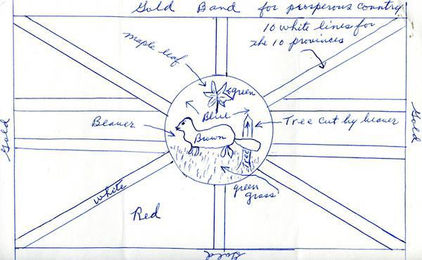 This beaver-themed design had the national animal sitting in front of the Union Jack, and next to a clearly labeled “tree cut by beaver.”
 -
10.
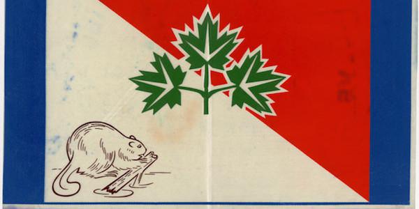 This beaver design was one a thousands just like it. The combination of the beaver and the three leaf branch was the most popular design motif to be sent in.
 -
11.
 As described by it’s creator, this flag was green because Canada is a mostly green land. The leaf and stems represent wheat, and “the design is equally good with or without the beaver – though the beaver represents our life so well.”
 -
12.
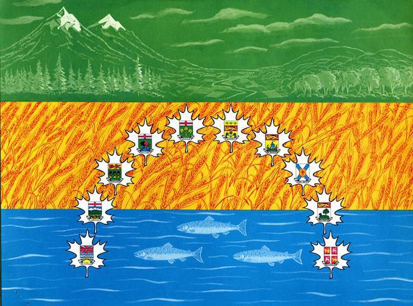 Mountains, wheat fields, and endless rivers. A colorful inclusion, but it was ultimately not considered as a serious candidate.
 -
13.
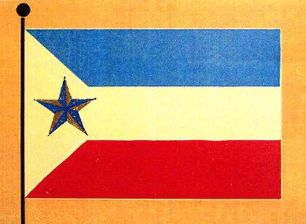 This design from Manitoba featured Polaris, the north star as the prominent symbol.
 -
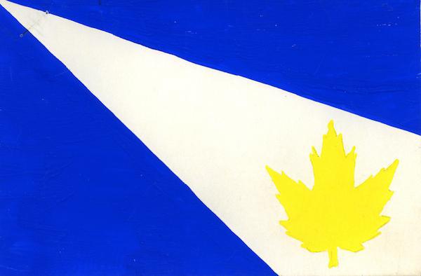
14.
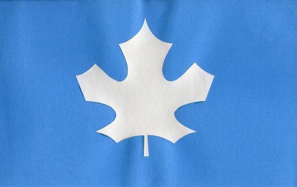 The purity of the white leaf surrounded by the ocean.
 -
15.
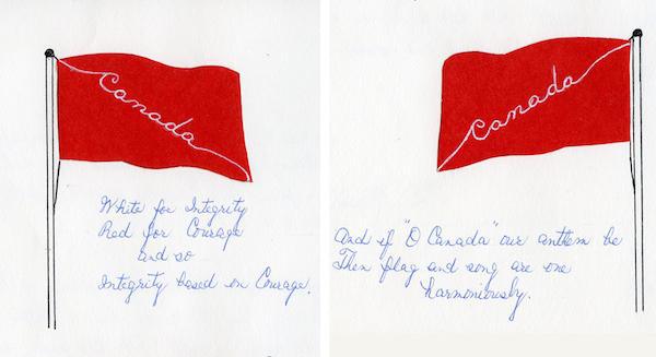 Symbols are so 19th century. This flag design went for a more literary approach.
 -
16.
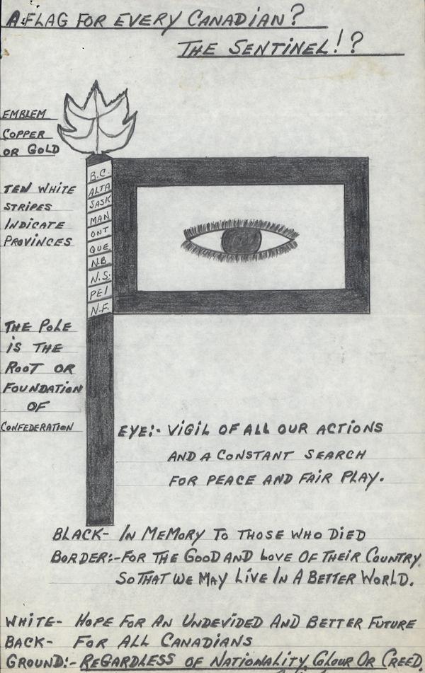 This flag design, known as the Sentinel, was described by its author as a “VIGIL OF ALL OUR ACTIONS AND A CONSTANT SEARCH FOR PEACE AND FAIR PLAY.” Kind of looks like the eye of Sauron.
 -
17.
 The whole of Canada shining in perpetual light. This design was passed over as being too religious. The phrase “shining in perpetual light” was seen as too referential to Roman Catholic prayers for the dead.
 -
18.
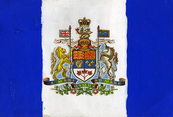
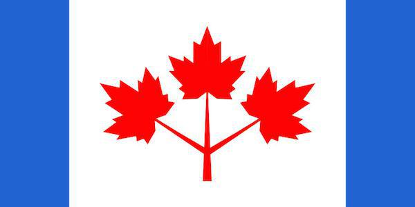 The three finalists: this design by Prime Minister Pearson.
 -
19.
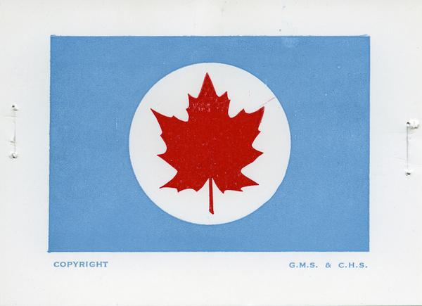
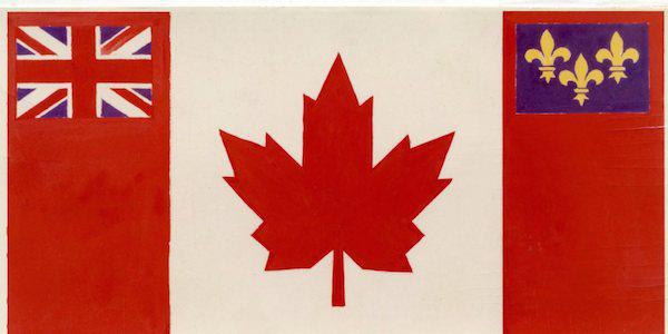 This suggestion from John Diefenbaker. and of course the one we all know today as the winner.
- REPLAY GALLERY
-
- Canada Almost Had A Very Weird Flag - 21 pics
- NEXT GALLERY
-

- 25 Things People Are Boycotting & You Should Too

There will be beavers (and Beatles for some reason).
19/19
1/19


0 Comments