
25 Design Fails Caused by Bad Font Spacing
Nathan Johnson
Published
10/22/2020
in
Funny
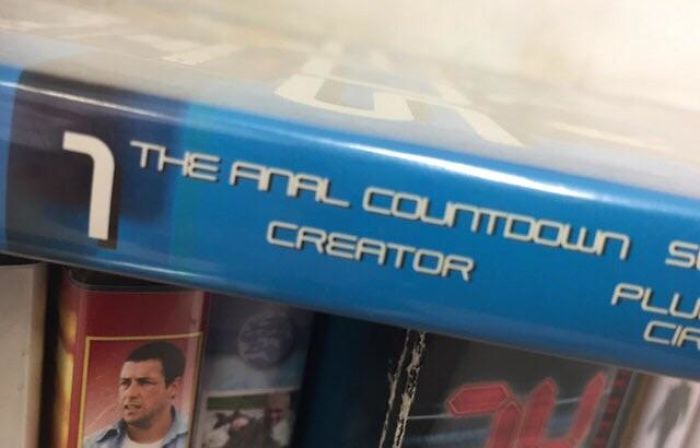
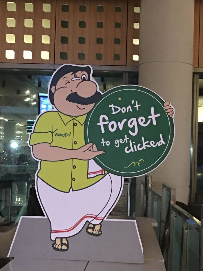
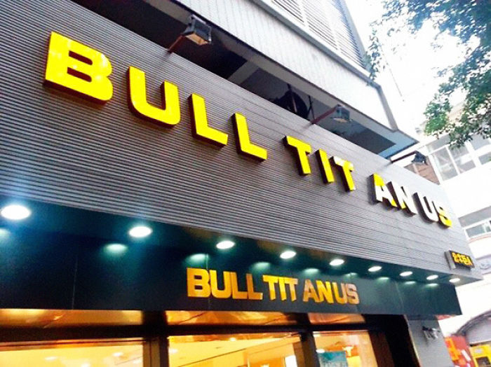
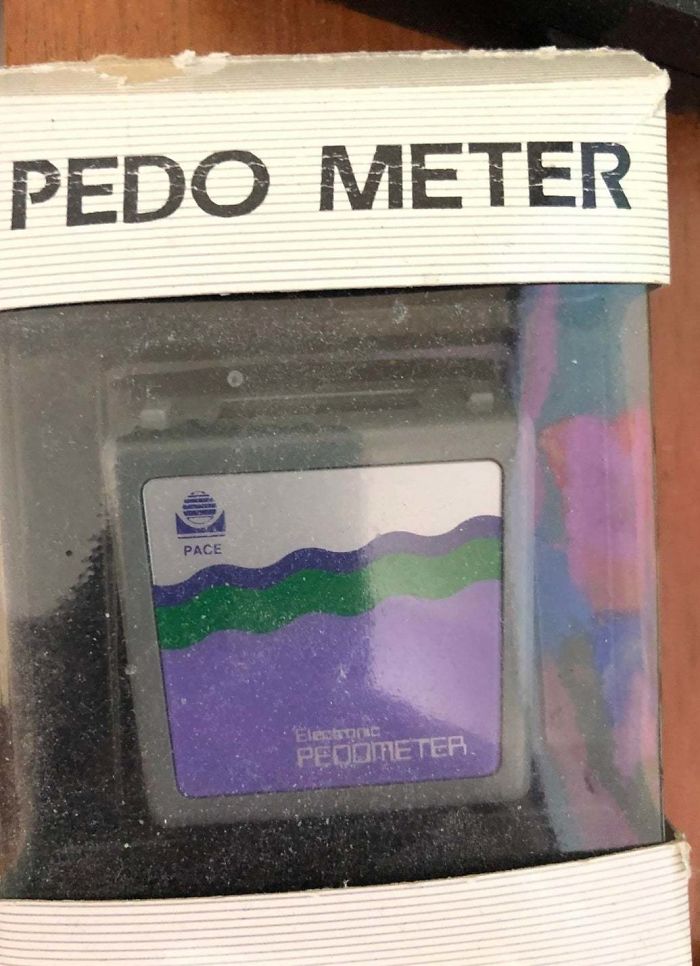
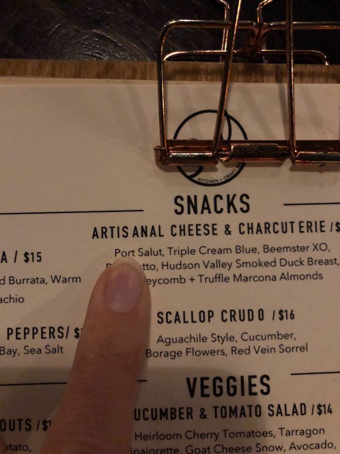
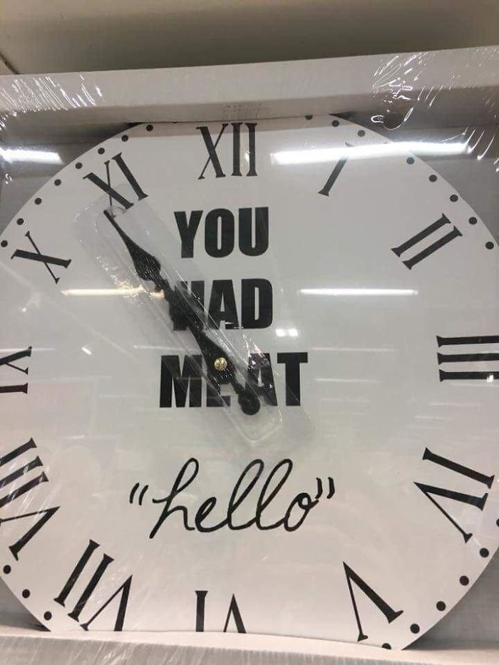
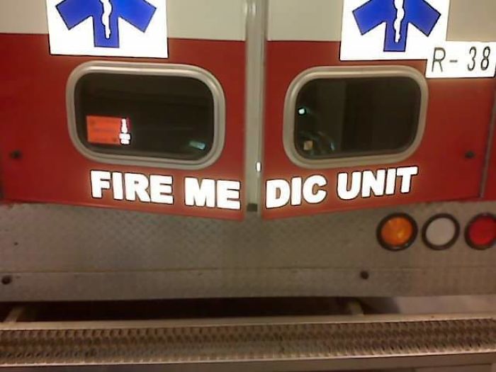
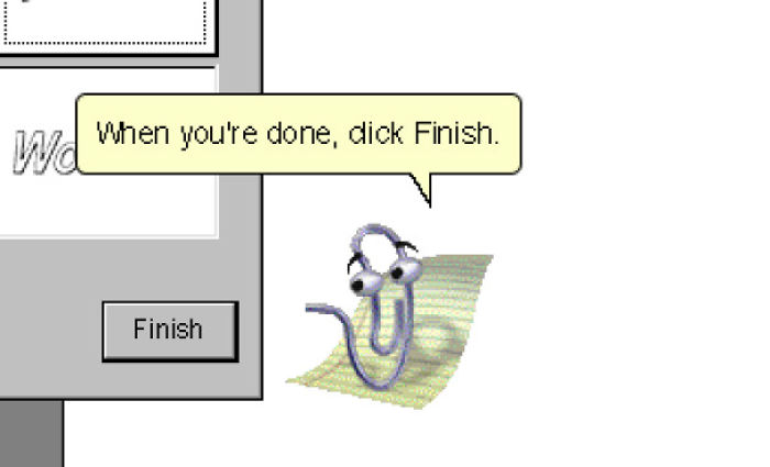
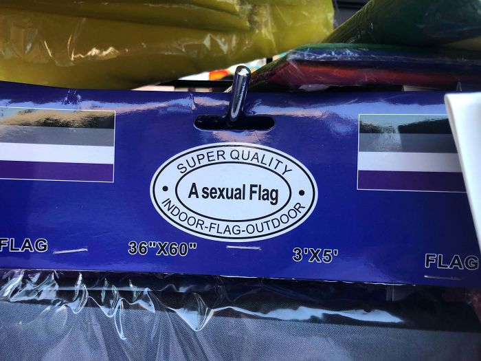
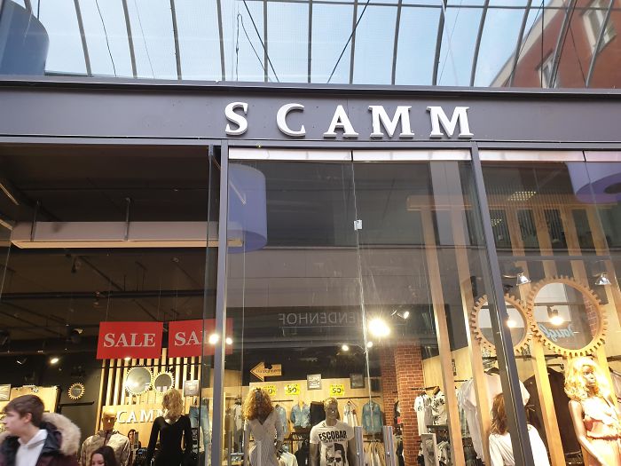
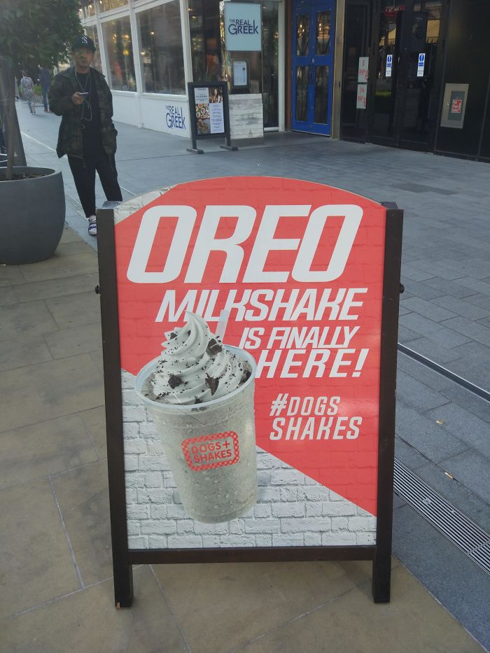
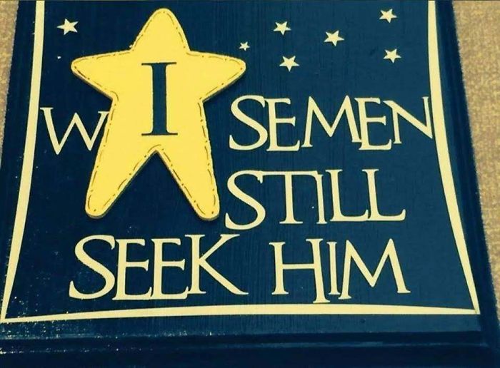
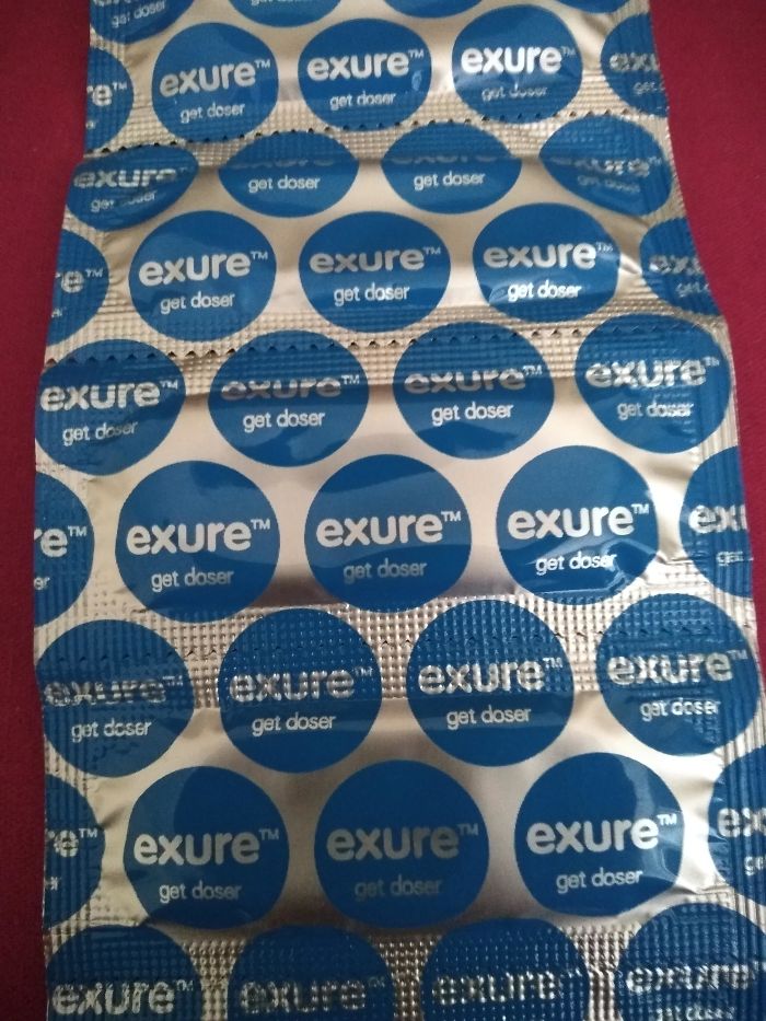
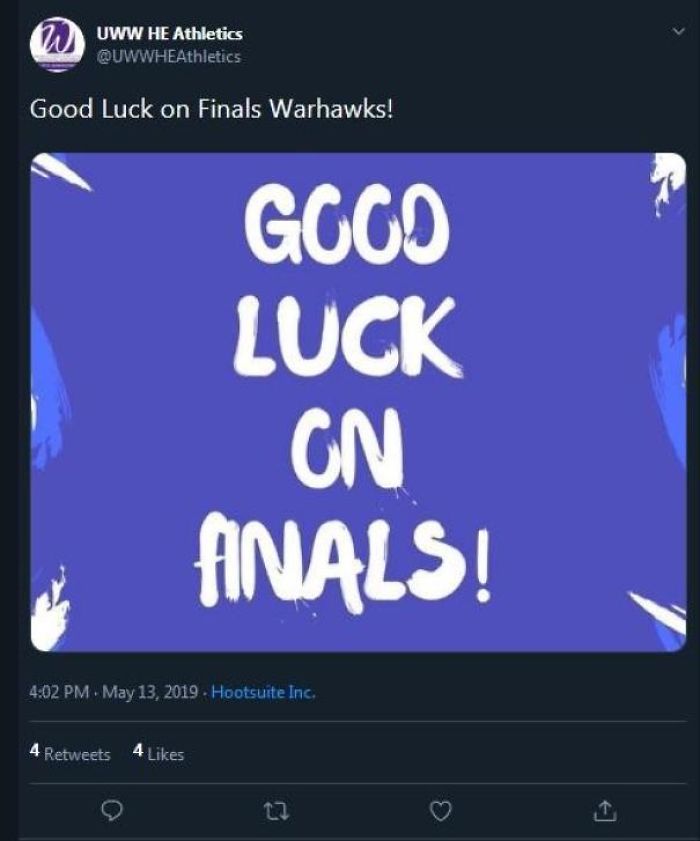
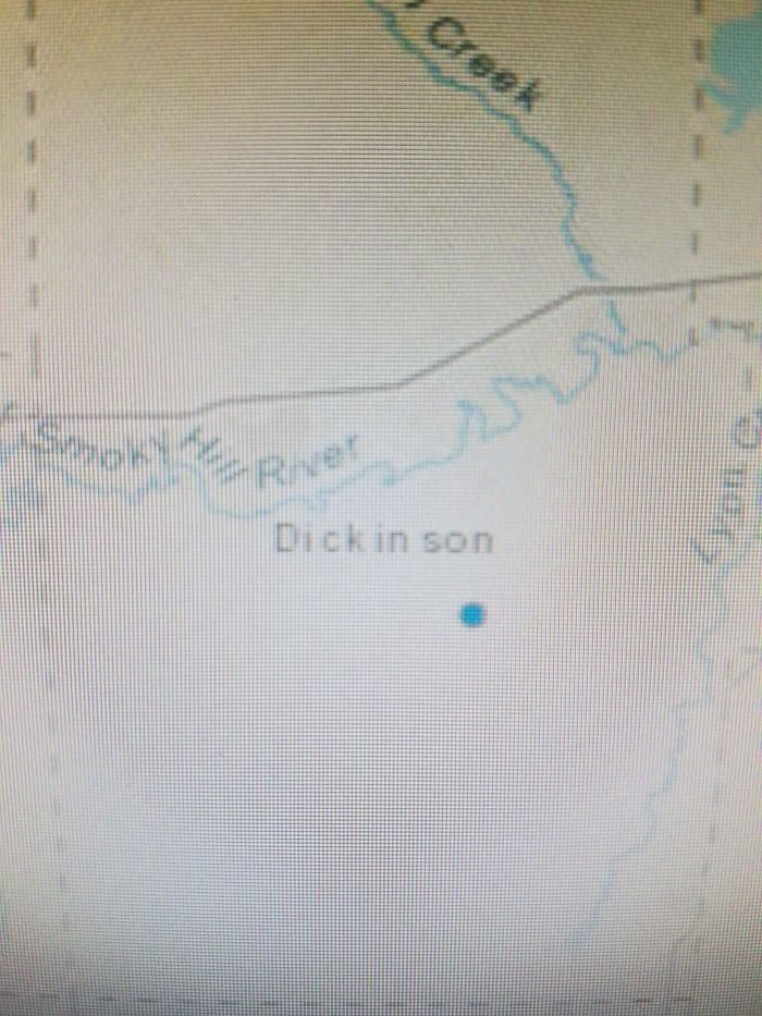
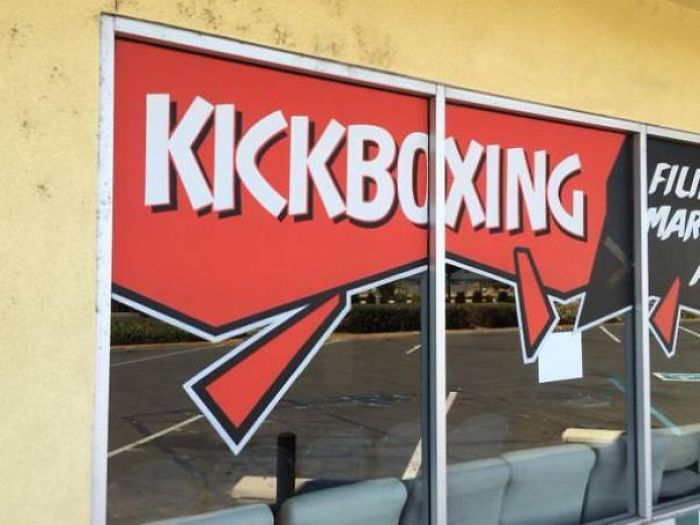
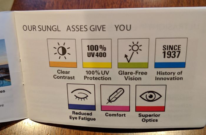
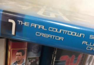
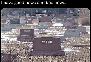
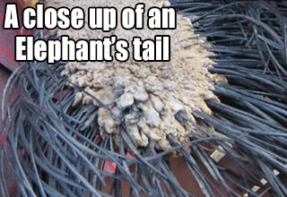
Fun fact - the process of adjusting the spacing between individual letters in a given typeface is called "kerning." You see, not all fonts are spaced perfectly and sometimes require adjustments to avoid design fails like the ones seen here.
These are all prime examples of why you should *always* review your designs to make sure the fonts are behaving properly and you're not getting weird spacing that makes a mockery out of your hard work.
These are all prime examples of why you should *always* review your designs to make sure the fonts are behaving properly and you're not getting weird spacing that makes a mockery out of your hard work.
- List View
- Player View
- Grid View
Advertisement

-
1.
-
2.
-
3.
-
4.
-
5.

-
6.

-
7.
-
8.
-
9.
-
10.

-
11.
-
12.

-
13.
-
14.
-
15.

-
16.
-
17.

-
18.
-
19.
-
20.

-
21.
-
22.
-
23.
-
24.
-
25.

- REPLAY GALLERY
-
 Replay
 - 25 Design Fails Caused by Bad Font Spacing
- NEXT GALLERY
-

- 16 Celebrities Wearing Other Celebrities
25/25
1/25


4 Comments